


What I Tell My Clients About White Paint
Not all white paint is created equal. These designer-approved shades bring warmth, depth and just the right mood to your home.

White Is One of the Trickiest Colors to Get Right
White is one of the trickiest colors in the designer’s palette. It seems so simple, so neutral, so… vanilla. But the truth is, when white is good, it’s transformative. And when it’s off? It can suck the life right out of a room.
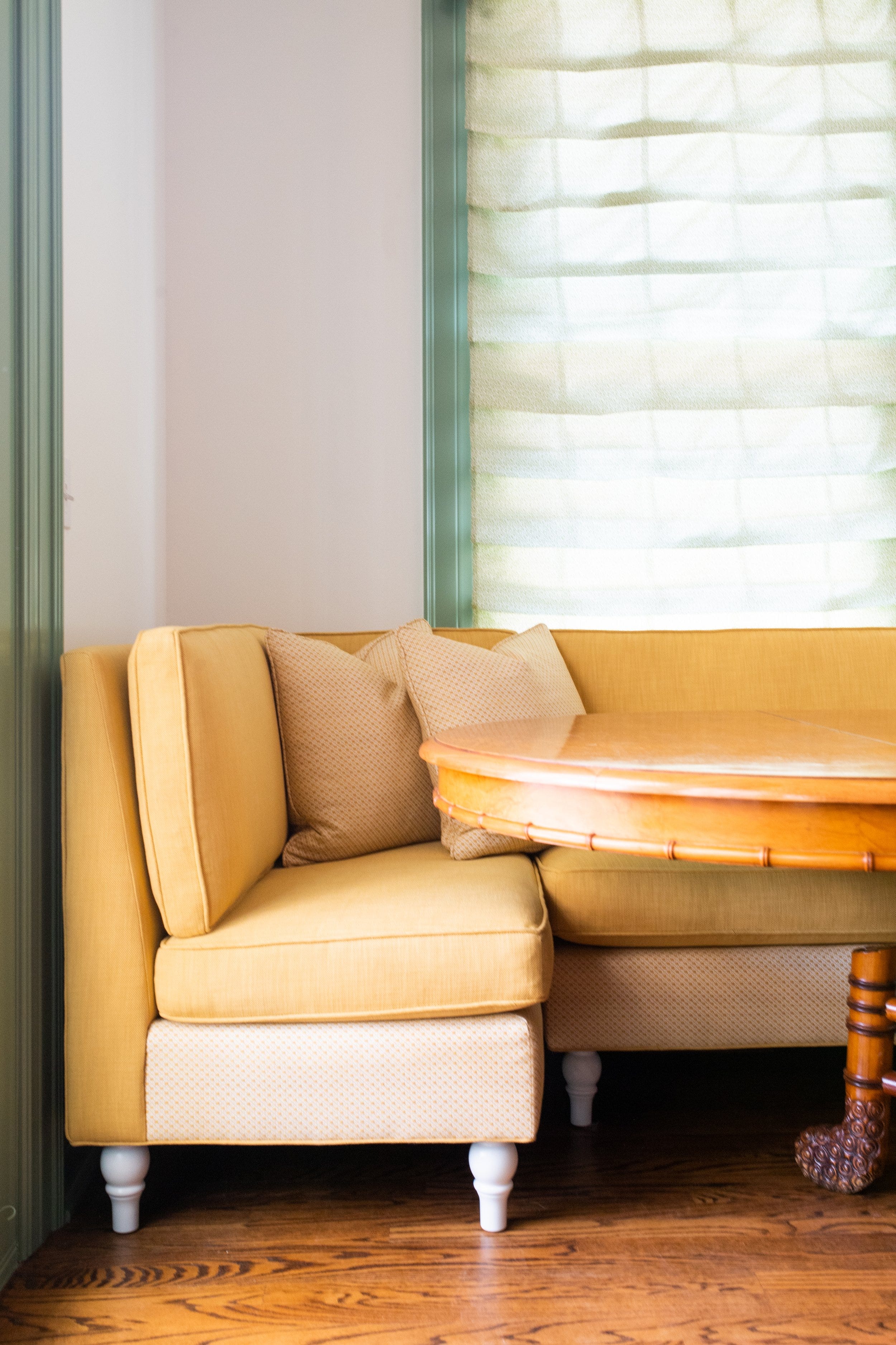
The right white can make a space feel soft or sharp, calm or crisp. It can be cozy or gallery-like. It can highlight your favorite antique mirror or make your millwork sing. But finding that right white? It’s a bit like chasing a cloud.
It differs from client to client (each with their own unique aesthetic) and from house to house—the light changes everything. A white that sings in one home may fall completely flat in another, and that’s part of what makes this search both maddening and magical.
I’ve tried many whites over the years—on walls, on trim, on ceilings, on cabinetry. I’ve chased warmth without too much yellow, cool without it turning blue, and the perfect backdrop that feels neither sterile nor flat. Below are my go-to whites—the ones I return to time and again because they’ve earned their place in my designer heart.


✨ A Note to Readers
We’ve been steadily welcoming more paying subscribers here (thank you, truly)—and as this little community grows, I’d love to offer more content that goes a bit deeper behind the scenes.
In the coming months, you’ll start seeing more posts just for paid subscribers—simple, useful things like tips and tricks I’ve learned along the way, sources I return to again and again, maps I’ve curated from my travels, and small ideas to help you create spaces that feel warm and layered.
Of course, this in no way replaces—or holds a candle to—the depth of the work we do one-on-one with our clients, or the invaluable guidance they receive through that process. But it is a little peek behind the curtain of my creative world, and a way to share more of what I’ve gathered through years of curiosity and experience.
If you’ve been enjoying this space and would like access to that deeper layer of content, I’d be honored to have you join as a paying subscriber. Your support allows me to keep creating here—and it means more than you know.
Thank you for being here, and for connecting with me around the idea that curiosity and warm design can so deeply shape how we feel in our homes—and in our lives. ✨
Wondering how to know if a white will feel too stark, too cool, or just right in your home? I’ll walk you through what I’ve learned from years of trial and error.
Keep reading with a 7-day free trial
Subscribe to Pastiche Studios Substack to keep reading this post and get 7 days of free access to the full post archives.